Working for a software company with very specific ways of doing things can mean yours skill come in a slightly different flavour. Although they are pretty much the same – It was time go back to school for a refresher.
User experience is such a huge part of digital design these days, product design methodologies have made a huge impact. I wanted to add another string to my bow, it was time for a refresher.
Course Tutor
Stefano Bellucci Sessa
App Design
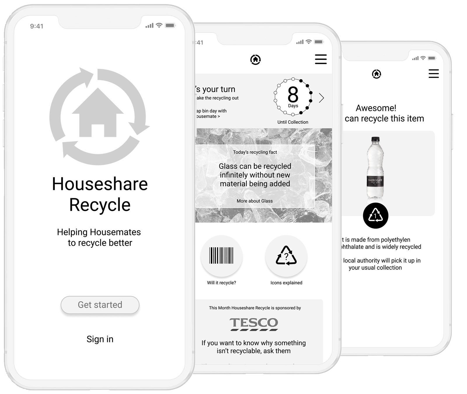
Design an application to help London Flatmates to improve their recycling.
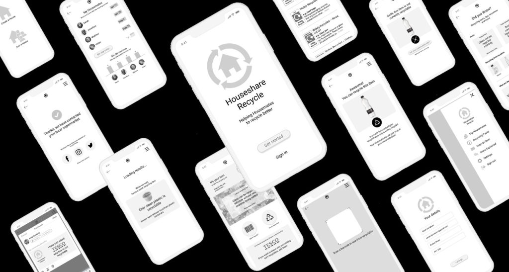
Everyone in our user interviews complained about the lack of information available. What is recyclable and what isn’t. What do all the icons on packaging actually mean? Our app came packed with a tonne of information, icons explained, bid day reminder and a barcode scanner with an ‘ask your supermarket why this isn’t recyclable’ button.
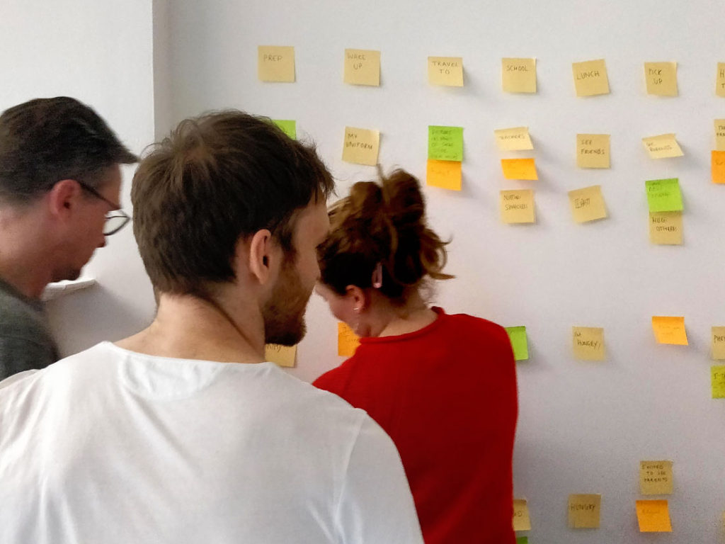
Wall session defining patterns.
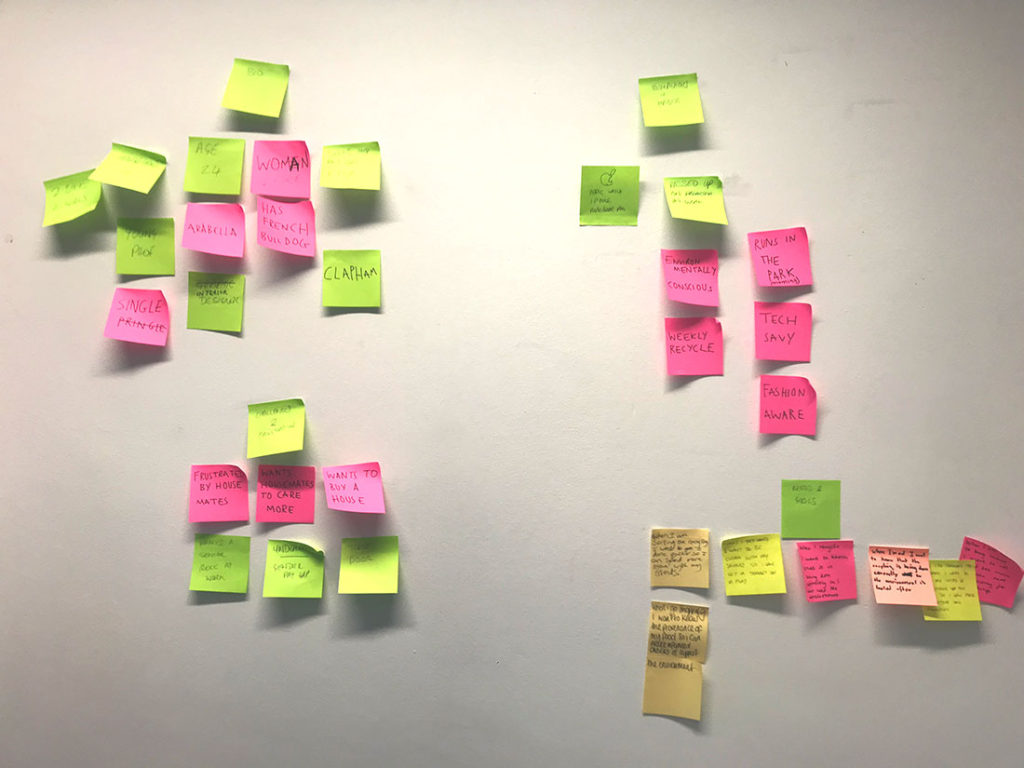
Wall session defining patterns.
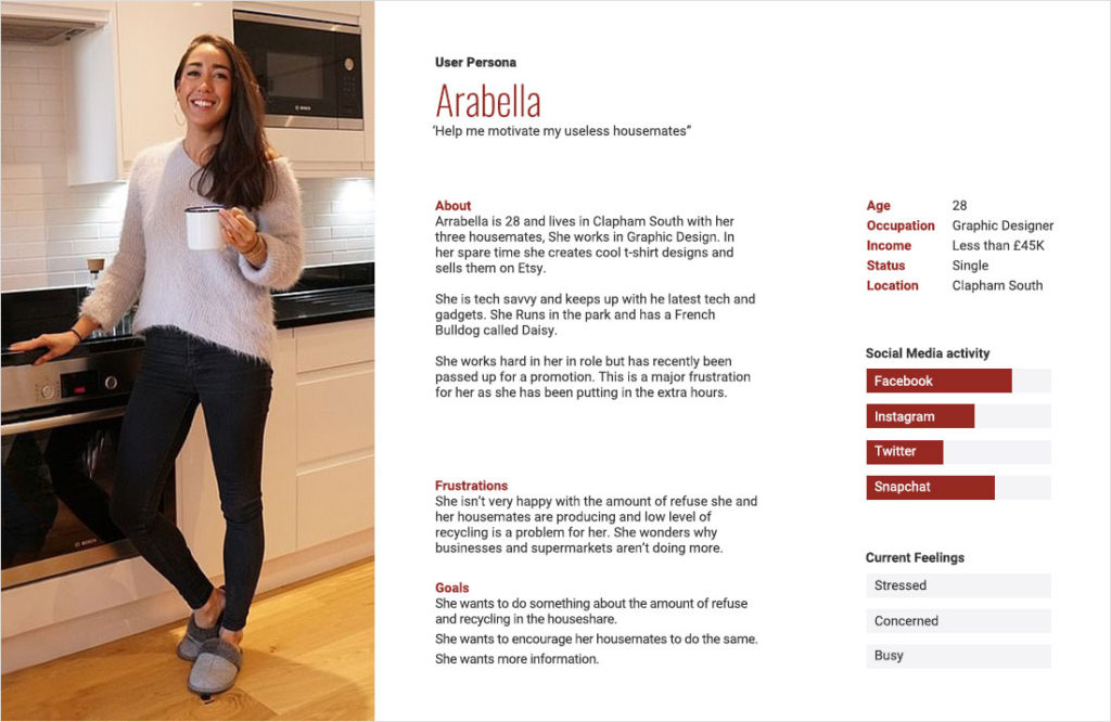
For the purpose of this exercise, we had wall session and came up a potential persona to work with.
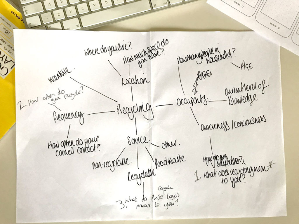
Workflow diagram.
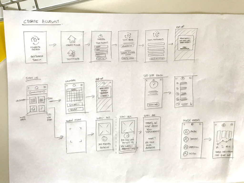
Workflow diagram.
Initial sign up screens put together in Marvel.
First hit at wireframes in Figma.
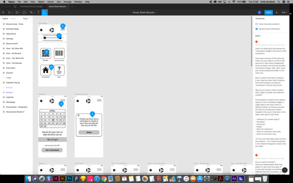
Wireframe first hit – Comments for improvement in Figma.
Comments taken in and improvements made. Next steps – bring in some colour.
This animation was created in PowerPoint and is based on Julia Allum’s Apollo 11 illustration. The moment I saw it I wanted to make it move.
I love the way she captures moments in nature, events and locations in her unique and recognisable style. Needless to say, I am a massive fan.
This animation was created in PowerPoint and is based on Julia Allum’s Apollo 11 illustration. The moment I saw it I wanted to make it move.
I love the way she captures moments in nature, events and locations in her unique and recognisable style. Needless to say, I am a massive fan.